In The News
August 2013 Syleconomics - Business numbers starting to look better
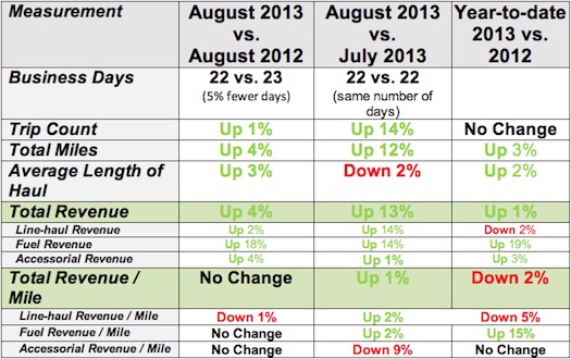
August 2013 vs. August 2012: The numbers below need to be adjusted for business days. August 2013 had 1 fewer (5% less) business day (August 2013 had 22 business days vs. August 2012 had 23 business days). Taking this into account, August 2013 was actually about 6% stronger than August 2012. Line-haul rates finally started to show some rebound and starting to push back to levels experienced in the past few years. Capacity numbers are showing a relative stability, but we have yet to reach 2007 levels, so there should still be good upward pressure on rates as we head into the typically busier fall season. See charts below for more information.
Good news … this is the 3rd month in a row where we see year-over-year revenue growth and volume. Concerning news … rates are still slightly below prior years.
The August 2013 vs. July 2013: August 2013 and July 2013 had the same number of business days, so no adjustment needs to be made for this. July tends to be one of the weakest (if not the weakest) business month of the year compared to August which tends to be a stronger month. So a decent pick up in business from July to August is anticipated. However, July was one of the strongest July months ever since we started recording (7 years), so the August numbers are still impressive. The first few days of September are seeing a relatively strong continuation of the August numbers.
We continue to see (and hear about) softness in the rate-per-mile and we are tracking 2011 numbers and below 2012 numbers in terms of rate/mile. However, we are finally seeing some rate increase and we should expect the rate to increase in the near term as capacity continues to lag demand. The charts and graphs below clearly show this trend.
The
Year to Date figures show that business volumes are running about the same as last year.
Due to a stronger July and August, business volumes and revenues are now tracking 2012 numbers, but rates are still slightly behind last year (a common theme).
Capacity continues to lag and has still not reached 2007 levels. Again, we are finally seeing rates start to creep back to 2011 and 2012 levels.
Truck Searches and Load Postings: It seems that the members of the Alliance continue to leverage the network for variable capacity needs rather than recruit more trucks/drivers. In July, FedEx Custom Critical began posting their excess freight on the Sylectus network which has provided a healthy boost to the available loads on the network.
Here are the metrics in a table format (note … to be included in the data analysis, companies had to be on our system for all reporting periods):
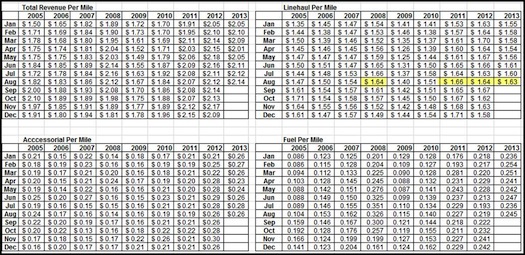
Breakout of Revenue by Revenue Type:
In the above table, we show changes in TOTAL revenue and then the changes in the components of total revenue (line-haul, fuel and accessorial). Here is the breakout by percentage of Total Revenue.
Line-haul revenue represents 76.0% of the total revenue
Fuel revenue represents 12.3% of the total revenue
Accessorial revenue represents 11.7% of the total revenue.
Chart Analysis:
If you look at the table below … you will see that Line-haul revenue per mile in 2008 was in the $1.50 to $1.60 per mile. In 2009 the Line-haul revenue per mile has slipped as low as $1.25 before rebounding to the mid $1.40 range. 2011 rebounded and ended the year nicely, and 2012 has continued the good rate structures of 2011, even surpassing the 2008 high months that were affected by the high price of fuel. However, over the past few months, we have seen an erosion of the line-haul rate/mile.
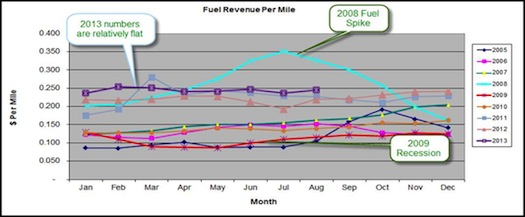
The good news is that “fuel rate per mile†has been steady for 2013..
At the “total revenue per mileâ€, 2013 is tracking below 2012 and the “line-haul rate per mile†is lower than 2012 and more in line with 2011.
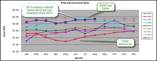
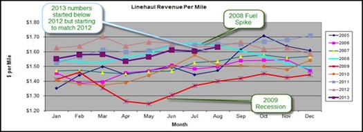
The following data / chart shows 2005, 2006, 2007, 2008, 2009, 2010, 2011, 2012 and 2013 in terms of total revenue per mile, line-haul revenue per mile, accessorial revenue per mile and fuel revenue per mile.
Total revenue per mile is a combination of
Line-haul revenue per mile,
accessorial revenue per mile and
Fuel revenue per mile.
The three charts below show Revenue per Mile for the past 8 years. We the show 4 charts of:
Total Revenue per mile (numbers include line haul, accessorial and fuel)
Just “Line haul†revenue per mile (rates have been relatively stable since June 2011).
Just Fuel revenue per mile (rates have stabilized since the 2008 fuel spike, but are starting to rise now).
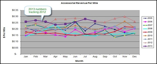
Just Accessorial revenue per mile.
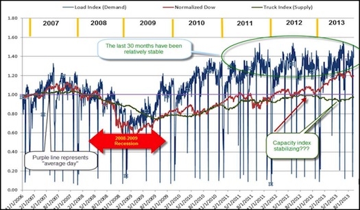
Sylectus created a graph to try and compare how the “Load Index†(Demand) and “Truck Count Index†(Supply) compares with the “Dow Jones Indexâ€.
The
“Load Index†(Demand) is the combined load counts of a subset of our customers normalized to an index value. A value of 1.0 is normal. A value of 1.2 is 20% above normal. A value of 80 is 20% below normal. We started recording the index on December 1, 2006, so we have over 6 years of data in the index now.
The
“Truck Index†(Supply) is the combined fleet counts of a subset of the same “load index†customers normalized to an index value. A value of 1.0 is normal. A value of 1.2 is 20% above normal. A value of 80 is 20% below normal. We started recording the index on December 1, 2006, so we have over 6 years of data in the index now.
We took the closing value of the Dow Jones Industrial Average (DJIA) and used the same process to normalize the data (we did this by using the same “measurement period†for calculating the normalization value). Just like the “Load Index†and “Truck Indexâ€, the “normalized DJIA†will have a value of 1.0 being normal and value of 1.2 is 20% above normal (etc.).
Below you will find the two normalized indexes charted from December 1, 2006 through to current date. The BLUE LINE is the “Load Index†(Demand), the GREEN LINE is the “Truck Index†(Supply) and the RED LINE is the “normalized DJIAâ€
Sources:
“Sylectus Index†– Summary of data from Sylectus companies.
“Dow Jones Industrial Average†– Yahoo database of Dow Jones closing values ( http://finance.yahoo.com/q/hp?s=%5EDJI&a=09&b=1&c=2006&d=02&e=31&f=2009&g=d).
So what does this chart tell us?
Supply of trucks (capacity) continues to lag below demand and was slowly recovering but has reversed that trend. It is back down below pre-recession levels.
The Demand (loads) chart is tracking better than 2007. 2010 and 2011 were great rides. 2012 started out ahead of the same period last year, but the last 6 months of 2012 tracked 2011. 2013 is now slightly below 2012.
About Sylectus
Sylectus is trucking’s most powerful network. Born in the new, cloud-based economy, it’s built on one simple idea … leverage the resources of your competitors to achieve extraordinary results for
your customers and for
your company.
Sylectus is more than Transportation Management Software. It’s a
web-based, protected, wealth creation network for managing in the New Trucking Economy. Designed exclusively for
progressive trucking companies,
Sylectus enables them to bypass the investment and time continuum to grow fast
NOW.